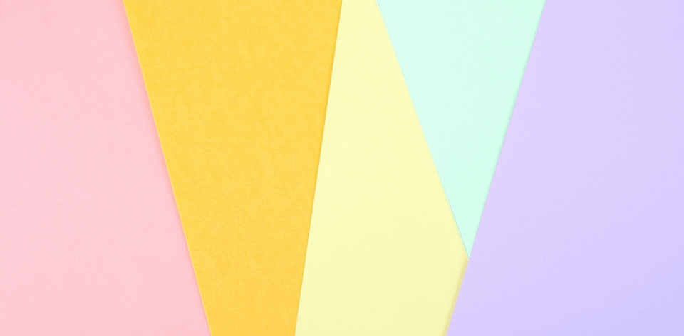
- Pastel colors are not necessarily a single hue, but rather a mixture of different colors.
- Pastel colors are trending for spring and summer, but they are also popular at other times of the year.
- Pastel colors are trending right now as a fashion trend as well as an interior design choice. They have been popular for a long time now, but this trend has been brought back to the forefront by celebrities.
- Pastels can be any hue or shade in the color wheel and often fall into one of three categories: Light, medium, and dark.
Categories of Pastel Colors
- Light: The lightest pastel is typically used for pastel drawing paper because it won't show through too much if you make a mistake.
- Darek: It's also typically used to construct other pastels by mixing it with darker colors like white or black. Light pastels are usually made from combinations like pink, yellow, and violet.
- Medium: Medium pastels are made by combining two complementary colors together
Different Pastel Colors
Pastel colors are light and delicate color. They are softer than their counterparts, but can still be bright and bold. Pastels can give the image of a happy and optimistic person.
- Baby blue: The color is often seen as calming and soothing to viewers. It’s also associated with youth and innocence.
- Light pink: Light pink is often used as a feminine color in painting, fashion, and cosmetics.
- Lavender: It's associated with royalty and aristocracy because it was worn by noblewomen during the Renaissance era.
- Mint green: This color has an association with nature because of its resemblance to plants such as mint leaves or grass on the lawn
Steps on Making Pastel Colors
Materials You'll Need to Get Started
- Pigment
- Calcium carbonate
- Talc
- A glass mixing surface
- A palette knife
- Distilled water
- A bucket
- Wax Paper
- Cookie Sheets
Let's get started!
Once the ingredients are in place, let us begin the recipe:
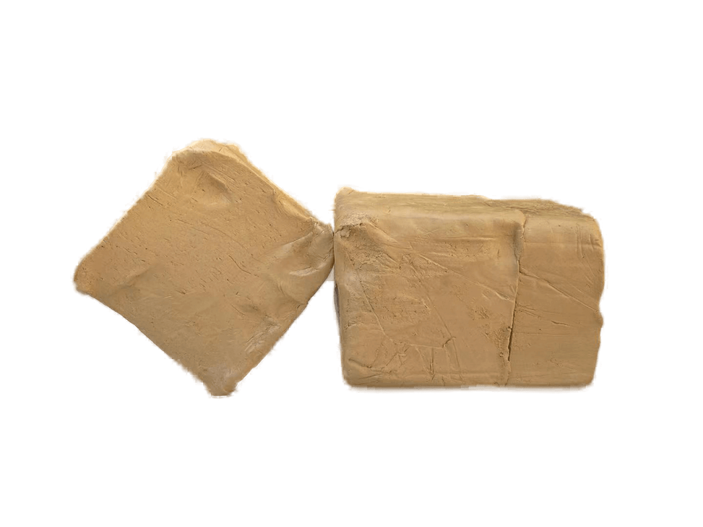
Step 1: Mix the calcium and talc.
To begin making pastels, mix equal parts of calcium carbonate and talc thoroughly in the bucket.
Step 2: Add the pigment and water.
Then make a colorful, rubbery, wet paste by mixing the pigment and distilled water in/on a glass mixing surface (such as a glass bowl or a large, deep, glass cooking pan).
Step 3: Combine them.
Then add the already prepared paste of calcium carbonate and talc to this.
Step 4: Shape your sticks.
Check for right consistency and then shape it in to pastel sticks, thin and long or short and squat. The liberty is all yours!
Step 5: Let them dry.
Place the sticks on wax covered cookie sheets and allow them 1-2 days to dry.
It's easy, and it's fun! Discovering how to make pastels is a great learning experience that will help you to grow as an artist. Try experimenting in creating different shade
s and tints of colors, too! While making them, you'll have the time to really think about the masterpiece you're going to create!
Why you should use pastel colors
There are several reasons why you should use pastel colors.
- The first reason is that it has a subdued hue, which makes it perfect for combining with other colors without creating a jarring eyesore. Another reason is that it is easy to work with most neutrals. And, even if you're working with a monochromatic design, pastels can be used to update the color scheme.
- The second reason to use pastel colors is that they are versatile and easy to work with. They can be used in a variety of design settings. For example, in the fashion world, pastels are often used to add vibrancy and freshness to the look. However, if you're trying to create a cheerful, uplifting look for a baby shower, you can choose a more subdued hue. For a feminine touch, light seafoam green is a nice touch.
- Using pastel colors is a great way to give a room a feminine feel. For example, if you're working with a room with an antique feel, you can use pastels in the furniture. A soft color scheme can add warmth to the decor and make it feel inviting.
- Using pastel colors can be a great choice for many designs. They blend with natural materials, such as wood and stone. And they complement pastel designs perfectly. The same goes for furniture. Adding soft-colored elements to your interior design will give your room a more elegant feel. In addition to using pastels, they are compatible with darker woods. They look great with dark woods. This will give your room a warmer and more welcoming feeling.
- Using pastel colors can add a sophisticated touch to your home. Using pastel colors in your design will also make it easier for people to relate to your brand. They can be more friendly and less aggressive than dark-colored designs. The color scheme you choose should also match the personality of the person using the room. If you don't want to use bold colors, you should try neutrals. They will make it easier for people to understand your brand.
- Using pastel colors will make your site look more feminine. It can also be used to emphasize a call to action button. The reason why you should use pastel colors is that pastel colors look better on light-colored screens. The fact that these colors are easy to wear and mix with other colors is one of the best reasons to choose this color for your site.