Matching colors is not an easy thing to do, yet once one has learned how to do it he or she will always be sought after for his or her beautiful works of art. It takes years of practice before you can master it, but in the end, it is worth all the effort. After all, who knows how beautiful your masterpiece will turn out to be?
Colors are usually classified according to their lightness, saturation, and hue. They are usually blended to create a mood, depending on what you want to express. For instance, if you are a person who likes vibrant colors, painting with reds, yellows and blues would be a good idea. This will bring out your adventurous side. However, these colors should not be used all the time, they should only be used during certain moments in your work. There are so many painting techniques that you have to know about.
Why is matching a color important in painting?
It's important to match color because different colors evoke emotional responses in individuals. For example, people may associate brown with "dirty" or "unattractive". Red may also represent passion and energy. Black can be associated with power. Different types of paint colors will affect the mood of the room as well so it's important to pick colors that go together.
What are the best combinations of color in painting?
-
Yellow and Orange
Yellow and orange is another widely used combination in paintings. When you paint these colors, you can create an impression of warmth. However, these colors can also make people turn their heads towards you. In order to create a lively effect, you can add a touch of magenta. If you are interested in this color combination, then you should know that this combination tends to create mystery and appeal in a painting.
-
Blue and Black
Blue and black is yet another common combination that can be used in oil painting. When you paint these two colors, you can get a sense of tranquility. However, there are also various other interesting implications when you use these colors in a painting. Black creates mystery and black can create impressions of mystery and despair. If you are interested in this color combination, then you should know that using this color can help to create a dramatic effect in your painting.
-
Green and Purple
Green and purple is another great combination that can be used in paintings. This is due to the fact that these two colors have a profound impact on human emotions. If you add purple to the mix, you can create a sense of mystery and intrigue in people. It can also help you to create interest in some scenes and enhance drama. There are many other interesting impacts that you can get from using these two colors in your paintings.
-
Red and Orange
Red and orange is yet another one of the most common combination in painting. You can create a warm feeling in your paintings if you choose red over orange. Another interesting aspect about these two colors is that they can also change the whole mood of the painting.
-
White and Green
White and green is another interesting way to combine colors that will have an impact on your audience. White can create an air of serenity and calmness whereas green adds a sense of freshness and harmony to the atmosphere. These two colors can be used to create a very peaceful environment in which your audience can easily relax. You can also add different shades of these two colors in a painting in order to create different effects. For instance, you can add sage and oak trees to your painting or create an olive garden with white and green trees. The choices are only limited by your own imagination.
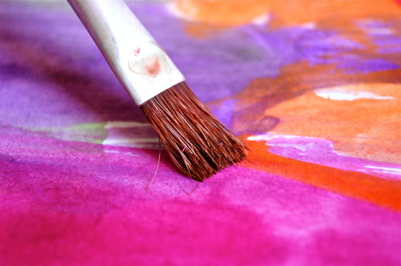
Step by step on matching colors:
Step one: Select the color you want to match.
Step two: Put a small amount of the desired paint on the sample board.
Step three: Apply that same color directly across from it in order to compare them with each other.
Step four: If they look similar but not exactly alike, move back and forth between both colors until they are very close or identical.
Step five: Once your final decision is made, place all materials used in an empty box for storage purposes later on if needed again in the future.
If your painting is done in natural light, then it is best to use light colors. The light will make the colors pop out more. In addition, if your painting is done in natural light, then it is best to use medium colors. The medium colors will make your painting look more realistic.
When working with art canvas and acrylic paint, color matching can be an important step in achieving the desired result. The process involves selecting the color you want to match and applying it to a sample board alongside the desired paint. By comparing the colors directly, you can adjust the mixture until the colors are identical or very close. Once you're satisfied with the final result, be sure to store all materials used for future reference.